Things designers need to know to collaborate with developers (Oh! Design Day 2nd)
2023/10/11 | 5 mins-
Rani (Brand Design)
-
Designers collaborating with developers and planners
Those who are collaborating with various departments
THOSE WHO ARE CURIOUS ABOUT DESIGNERS OF B2B AND AI COMPANIES
People who are thinking about solving the cause of a problem through design
-
IN THE IT INDUSTRY, COLLABORATION BETWEEN DESIGNERS, DEVELOPERS, AND PLANNERS IS ESSENTIAL. HOWEVER, AS WE DO DIFFERENT JOBS, THERE ARE BOUND TO BE DIFFERENCES IN PERSPECTIVES. HOW CAN WE CREATE SYNERGY BY LEVERAGING THESE STRENGTHS?
In the second Oh! Upstage designers' shared practical experiences and ways to love your work and life more! See you at Design Day.
-
✔️ Session 1. Development architecture from a designer’s perspective One-Pager
✔️ Session 2. Establishing an Upstage design system
✔️ A designer and designer counseling center that listens to designers’ concerns
✔️Design loved by designers
✔️From Designer
✔️ Lastly, Dear, Designers
Hello, this is brand designer Rani 🍳. Oh!, the design chapter's offline communication event that we first introduced in our previous article 'What it's like to work as a designer at a B2B AI company'. Design Day (aka Audi Day) is here with the second story.
AS THE DESIGN CHAPTER IS A GATHERING OF UPSTAGE IN-HOUSE DESIGNERS, IT IS OPERATED WITH THE PURPOSE OF SHARING EXPERIENCES GAINED AT WORK AND MAINTAINING NECESSARY COMMUNICATION BETWEEN DESIGNERS. THIS ODI DAY CONSISTED OF AN EXPERIENCE SHARING SESSION WITH UI/UX DESIGNERS DONGSIM & CARRIE, CONCERNS THEY HAD AS DESIGNERS AT AN AI COMPANY, AND A TIME TO SHARE THEIR PERSONAL TASTES AS DESIGNERS. THE SECOND ODI DAY WHERE DESIGNERS TALKED ABOUT WAYS TO LOVE THEIR WORK AND LIFE MORE! SO LET’S GET STARTED RIGHT AWAY.
Experience Sharing Session
Session 1. Development architecture from a designer’s perspective One-Pager
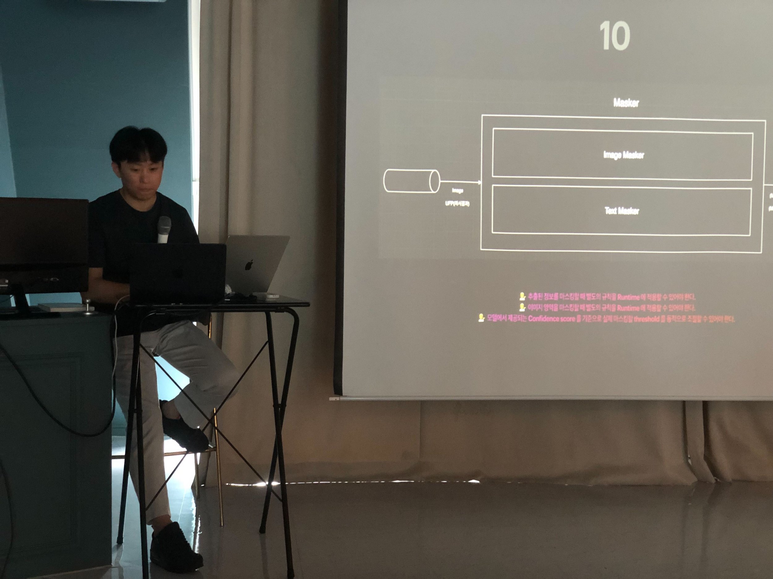
THE FIRST EXPERIENCE SHARING SESSION WAS CONDUCTED BY DONGSIM, WHO IS IN CHARGE OF UI DESIGN AND PLANNING IN THE DATA TEAM.
If you go to the IT book corner, you can easily find a book titled 'Why do you fight with developers? Why do developers say no every day?' Although it is a sentence used for humor, it is also a point where problems actually arise in the workplace. So how should designers view this problem? Dongsim said that as a designer, he thought he needed to know the developer's perspective and process in order to perfectly realize the design he planned and drew. To help developers, designers, and planners become closer, he shared insights gained through actual work and talked about relatable parts from recently read books, 'All About Software Specifications' and 'Today, Again, Developers Said No'.
How to Turn Differences in Perspective into Different Strengths
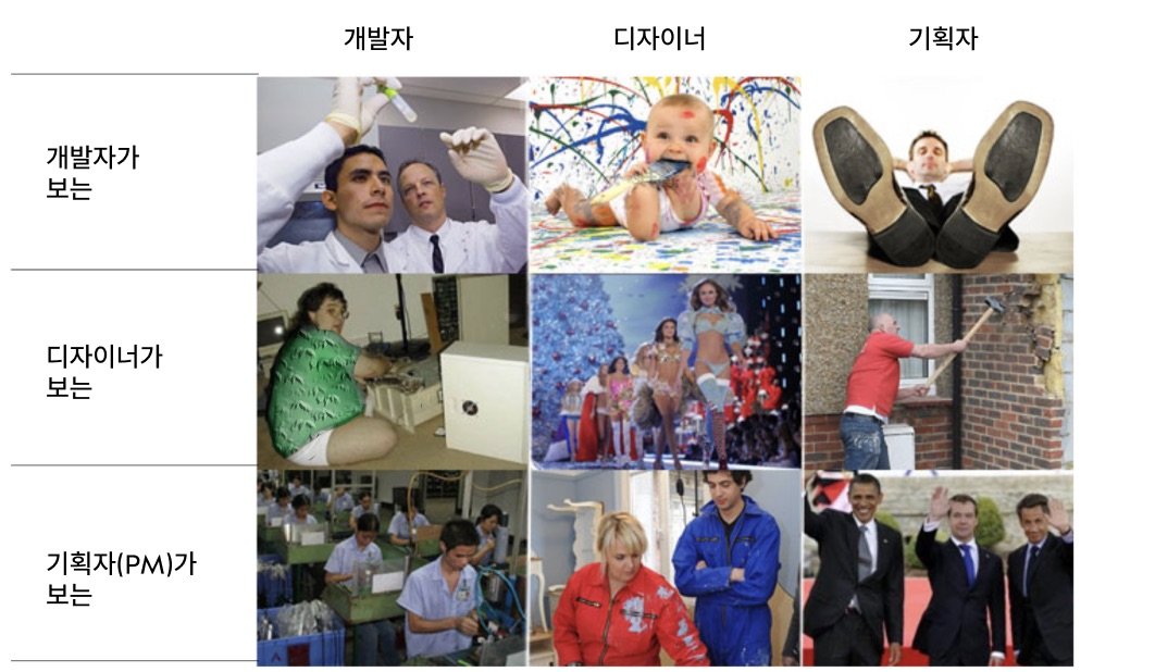
Differences between planner, designer, and developer perspectives
TO CREATE OUTSTANDING PRODUCTS, THE THREE DEPARTMENTS OF PLANNERS, DESIGNERS, AND DEVELOPERS WORK CLOSELY TOGETHER. HOWEVER, AS CLOSE AS WE ARE, WE DO NOT KNOW EACH OTHER'S WORK IN DETAIL. PLANNERS (OR UX DESIGNERS, POS, PMS) FOCUS ON EXTERNAL ASPECTS SUCH AS CUSTOMER REQUIREMENTS, SCHEDULES, AND STRATEGIES (PROFIT GENERATION), DESIGNERS (ESPECIALLY UI DESIGNERS) FOCUS ON USABILITY, INTERFACE, AND VISUAL DESIGN, AND DEVELOPERS FOCUS ON DEVELOPMENT POSSIBILITIES. WE FOCUS ON SMOOTH PROGRAM OPERATION AND DATA FLOW.
❓ What do you focus on? What strengths do you have?
📐 Designer (UI Designer)
Usability, interface, aesthetics, screen unit composition, user usage flow
📊 PLANNER (UX DESIGNER, BROADLY PO, PM)
Broadly focuses on external aspects such as reflection of customer requirements, schedule, and strategy (profit creation)
⌨️ Developer
Development availability, smooth program operation, data movement flow
Meme about the perspectives of developers, designers, and planners / Source: Excerpt from Microsoft Issue 393, https://bit.ly/war-developers )
Developer's plan, specifications! So what is it?
As described earlier, the three positions are closely collaborating. Among these, the 'development' field has been considered a separate field and one that one does not need to know about. So should you learn a development language and how to develop it? Rather, I wanted to understand the background and process of how developers receive requirements and create plans.
“ A developer collaborating with me asked, “Why don’t you learn development?” This does not really mean that you should study and develop a development language. Please note that this is because by directly experiencing development, you can see how each element is actually applied to the product. ”
The development document represented to developers is SRS (Software Requirements Specification), which has been used in Silicon Valley for a long time. This is also called Specification or Spec. Specifications are located before the start of development and have the appearance of analysis and design together.
REQUIREMENTS AND SPECIFICATIONS, POSITION OF SRS IN THE PROJECT / SOURCE: ALL ABOUT SOFTWARE SPECIFICATIONS
In terms of scale, it can range from a few issues to a one-pager, which is an official document shared in the early stages of writing specifications, a general SRS of several dozen pages, and a large specification document of hundreds to thousands of pages. The specification includes 'project vision, business strategy, functional requirements, user hierarchy, backward compatibility, external interface, system interface, user interface, operating environment, deployment method, business rules, design constraints, system characteristics, assumptions and dependencies, and performance'. etc. are included.
(Items not included: project schedule, project organization chart, number of people involved in the project, developer acquisition plan, developer training plan, developer training plan, development process, test schedule and plan user manual, internationalization process and schedule, translation process and plan, build automation plan, hardware and software purchase process and acquisition plan required for the project, outsourcing plan, library purchase plan for use, service personnel training plan, etc.)
Although SRS is a development document, it contains many words that are quite familiar in the planning and design fields. In fact, you can see that there is overlap in specifications, planning, and design from the why and how perspective.
💡 Proportion of Why, What, and How in planning, specifications, and design documents
Why – vision, business strategy, non-functional requirements, components and interfaces
What – Functional requirements, UI requirements, performance, environment
How – Non-functional requirements, components and interfaces, constraints
Source: All About Software Specifications
Upstage Development One-Pager
If you know the documents used by developers and the content contained in them, you will understand better by looking at the One Pager used in the field, right? We were able to take a look at the process of creating a one-pager document that Upstage's software engineer, Junyeop (thanks to Junyeop), actually wrote for work. To look more closely and understand more.
We looked at what items are covered in One Pager of PII Masker (Personal Identifiable Information Masker), a software that automatically masks personal information in a given document.
Introduction, definition, purpose, functional requirements, system requirements, model requirements, what is not covered in this document, design process (view), architecture, file server structure, database, etc.
While listening to how requirements were added to the data flow, I was able to understand the process of drawing the architecture of PII Masker and see it being fleshed out.
Finally, understanding each other
For designers who collaborate closely with developers, we only covered 'How developers work', but you can also easily find articles to help developers understand planners and designers, such as 'Planners you want to work with' and 'Designers who work well'. As we have a common goal of ‘making outstanding products,’ we need to think about how the product is made, how each other’s work affects production, and whether sufficient information is provided for collaboration and whether information is provided. Efforts to reduce the gap in a work environment where communication is important will bring us one step closer to creating better products.
Session 2. Establishing an Upstage design system
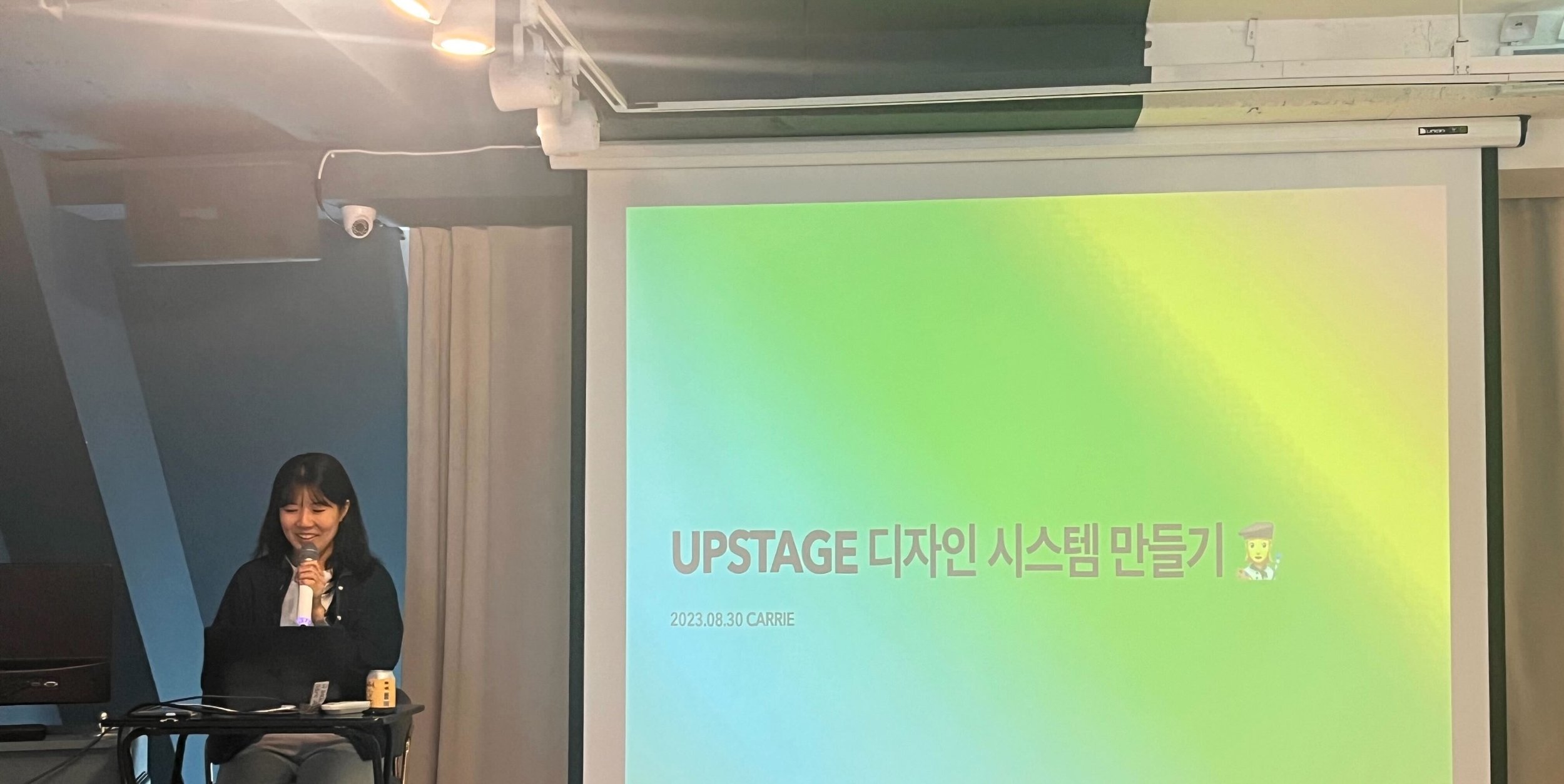
The second experience sharing session was a design system session by Carrie, a UI/UX designer from the SaaS team. Through this session, the background to creating the Upstage Design System and detailed information about the project currently in progress were shared.
Problems discovered while designing Upstage products
Currently, Upstage includes products that are reaching customers with a completed appearance, but there are also products in various states that were created in various contexts, such as simple demos to prove the concept before the commercialization stage. The exterior of the product could be made to look like there were no major problems if the designer created it according to the brand standards before it was shown to users, but the problem was that as the design became more diverse, the methods of developing it were also becoming more diversified.
Upstage products implemented through various design and development methods
So, we heard directly from Upstage product makers about the difficulties they experienced during the product development process. We heard detailed experiences from people who had experience designing and developing other products using the component library created when creating Document AI. The biggest inconvenience commonly felt by UX and UI designers who worry about the user experience of products and software engineers who develop product functions and screens was the lack of common assets and guides .
Data oven (left) and labeling space (right) produced using the Document AI library
🧑🎨 Designer Difficulties
The definition and purpose of each component were not clear. Even when I tried to do design work in Figma, there were too many different libraries, and I couldn't figure out which guide I should follow when creating.
There was insufficient scalability to use each component in products of a different nature from Document AI.
The component I wanted to use was not designed.
👩💻 Engineer’s Difficulties
There were no installable packages or guides to easily use the existing system, so I had to copy and paste the existing code.
For the product I was developing, a component with only simple functions was sufficient, but the Document AI component was so complex that it was more efficient to create it separately.
Component: A reusable, independent module or part created to efficiently manage design/development elements that are used repeatedly.
Document AI was created based on React, but because the labeling space used Vue, it could not be reused at all.
Shall we solve it together? With a design system!
WHEN YOU HEAR THE TERM DESIGN SYSTEM, YOU MAY AT FIRST GLANCE THINK THAT IT IS LIMITED TO THE DESIGN AREA. HOWEVER, A DESIGN SYSTEM REFERS TO A SYSTEM LIBRARY THAT INCLUDES DESIGN PRINCIPLES, UX PATTERNS, UI TOOLKITS, CODE, ETC. COLLABORATION BETWEEN DESIGNERS AND FRONT-END ENGINEERS IS ESSENTIAL TO CREATE THIS, AND THE MAIN USERS OF THE CREATED SYSTEM ARE ALSO TWO OCCUPATIONS. CURRENTLY, STARS WHO SYMPATHIZED WITH THE PROBLEMS EXPERIENCED BY VARIOUS TEAMS WHILE DEVELOPING PRODUCT SHAPES GATHERED TOGETHER TO FORM THE DESIGN SYSTEM TF.
THE TF AIMS TO HELP SOLVE EXISTING PROBLEMS AND REALIZE THE VALUES THAT UPSTAGE CONSIDERS IMPORTANT.
📌 Benefits expected from introducing a design system
speed
By using the common resources provided in the design system, anyone can quickly experiment with ideas without worrying about how the screen should look or be implemented.
communication
By unifying the language used for design and development, communication between practitioners is facilitated.
consistency
Achieve consistent usability and brand image by conveying various upstage products with one unified design language.
Concerns about finding the optimal method that suits us
The design system has many references, but no set answer. Carrie is working to create a design system that can easily apply new rules without abandoning existing production methods. This is because a good design system is not just about a nice appearance and strictly written rules, but also one that is optimized by taking into account the context of the people who use it. We introduce what Upstage is currently preparing to improve product development productivity, including the introduction of design tokens and concerns about incorporating development language into the design process.
Unifying languages using design tokens
Token name creation rules and examples
A DESIGN TOKEN IS THE SMALLEST COMPONENT THAT IS GIVEN A MEANINGFUL NAME SO THAT IT CAN BE EASILY REUSED. THE NAME CONTAINS USAGE, CHARACTERISTICS, VISUAL IMPORTANCE, AND INTERACTIVE MEANING, AND DURING PRODUCTION, WE WORK WITH THE FE ENGINEER TO CREATE THE MOST CONCISE AND EASY-TO-READ NAME. THE TOKEN DERIVED IN THIS WAY HAS AN INTUITIVE NAME, SO EVEN IF YOU NEED TO CREATE A SCREEN WITHOUT A GUIDE RIGHT AWAY, YOU CAN USE IT WITHOUT MUCH DIFFICULTY. ADDITIONALLY, IT IS A NAME CREATED THROUGH AGREEMENT BETWEEN DESIGNERS AND ENGINEERS AND IS USED SIMULTANEOUSLY FOR BOTH PRODUCT DESIGN AND DEVELOPMENT, THUS REDUCING CONFUSION IN COMMUNICATION.
USING CSS FRAMEWORKS IN DESIGN
Upstage has been using Tailwind, one of the major CSS frameworks, for UI development. The design hand-off method so far has been for engineers to replace the designed screen with the Tailwind utility class. Although this was not a major challenge, it caused inefficient additional man-hours to modify the results that were written differently from the designer's intentions.
To solve this, the designer decided to directly apply the utility classes provided by Tailwind to the design. Tailwind currently has the largest number of utility classes of any major CSS framework, which frees us from worrying about having to conform our designs to predefined classes. It also supports basic customization functions, and complex elements that cannot be drawn with the Tailwind utility class can be freely designed and defined as React components, so we can see that the advantages outweigh the limitations.
Code writing time shortened with Tailwind (Source: Coding Apple YouTube )
the wind ahead
WE HOPE THAT THE UPSTAGE DESIGN SYSTEM WILL BECOME A SINGLE, TRUSTED SOURCE FOR PRODUCT UXUI DESIGN AND DEVELOPMENT, AND A MEANINGFUL TOOL THAT WILL HELP YOU GAIN PRODUCTIVITY THAT CAN OTHERWISE BE LOST IN THE RUSH. IN THE LONG TERM, WE ALSO WANT TO DEVELOP UPSTAGE'S DESIGN LANGUAGE & RESOURCES INTO AN INTEGRATED GUIDE THAT CAN BE VIEWED IN ONE PLACE, SO PLEASE SHOW YOUR INTEREST AND SUPPORT!
A designer and designer counseling center that listens to designers’ concerns.
Following the sharing of experiences, we held a session at the Designers' Counseling Center where we talked about the concerns we wanted to share. Let’s find out what concerns they had and what they discussed as individuals and upstage designers.
📊 We recommend setting a standard by finding user data and presenting it as evidence. It would be a good idea to re-establish the standard when it is shaken.
🙂 I think the process of acceptance and change itself is also design.
🔍 In this case, I am using the method of going to the person who gave the feedback and asking about their intentions and details before making a decision. Ultimately, responsibility for design is mine as a designer.
🙆♀️ I think it is important to ask myself, ‘Can I proudly explain the basis for the result that comes from accepting numerous feedbacks?’ This is because you are the one who knows the best about the design you are working on and represents the results. Therefore, rather than accepting all the feedback, I think it would be a good idea to consider whether the evidence makes sense.
💸 I recommend that you enjoy the process of finding your taste in order to enjoy life more, not as a designer. When you spend money, you learn about your own tastes.
💬 Until I was in college, I didn't have a clear taste, so it was really awkward for someone to ask me what I liked. So, as if I was answering a prompt, I decided on an answer in advance. But as time went by and I experienced various things, I realized that I liked this kind of thing. You don't have to feel obligated to do it, but I recommend trying it like a quest.
🎬 I think I asked other people about their tastes. Recently, I've been asking people about life movies, and I'm trying to see if it's my taste or not.
🍿 I think I asked someone else too. Instead of asking several people, I asked the person who wanted to follow along.
🥸 I have the same problem. In the past, I think I had a preconceived notion that a designer must have great taste. Lately, I've been changing my thoughts. Even if you don't necessarily like or know enough to dig into something and become an expert, if you're even a little more interested in it than others, wouldn't you be able to say that it's your preference? I do.
💸 After securing capital, I think we should be able to create a product through market verification using data from various experiments.
🫥 Until a startup grows to a stable size, it seems inevitable to be swayed by the company's choices.
🤔 Why should we do advance research for money-making products? There is a point where I think: I think that if you try it without finding the title, it could end up being an odd idea.
👯 NOW, ‘EVERYONE WHO WANTS TO DO AI IN KOREA GATHER TOGETHER!’ IT'S A FEELING. IN THE EARLY STAGES, I THINK IT IS NECESSARY TO CRYSTALLIZE OUR MISSION, FORM RELATIONSHIPS WITH CUSTOMERS WHO ARE PASSIONATE ABOUT THIS MISSION, AND INTERACT FREQUENTLY TO DERIVE MEANINGFUL PRODUCT IDEAS AND VALUE. IN THE SPIRIT OF ONE TEAM, I THINK WE WILL ALSO NEED TO MAKE EFFORTS TO BUILD AN ENVIRONMENT WHERE OUR SERVICE AND THE BUSINESS OF KANBU CUSTOMERS CAN GROW TOGETHER.
Design loved by designers
Nine designers each selected their favorite app/web/product/service space and had time to operate freely. This was a time where we could get away from work and talk about our interests and tastes comfortably.
🍜 From. Tim
'Haidilao'
I RECENTLY VISITED A HOTPOT RESTAURANT, HAIDILAO. FROM THE MOMENT I WAITED, TO ORDERING, TO FINISHING THE MEAL, IT WAS GREAT. I FELT THAT IT WAS A WELL-DESIGNED SPACE WITH ONE ENTRANCE, A WELL-ORGANIZED FLOW PATH, A DOLL SITTING IN FRONT SO THAT CUSTOMERS WHO CAME ALONE DID NOT FEEL LONELY, AND A NAIL MACHINE PLACED SO THAT THE WAITING TIME WAS NOT BORING. I THINK IT WAS A WELL-DESIGNED UX THAT ALLOWED ME TO BE SATISFIED WITH THE OVERALL PROCESS OF USING THE SERVICE AND SPACE!
🌈 From. Kate
'Rainbow'
When I look at the colors of nature, I often think of wonder. I recently visited Mahanakhon Observatory in Bangkok. At that time, I looked at the rainbow and thought, ‘Wow, how can it be so red…’ yellow… Purple... !' I was amazed. (It was even a double rainbow.) It was sunset when I went up to the observatory, so everyone was watching the sunset from the other side. So only my group and I could monopolize the rainbow. I think the 30 minutes of monopolizing the rainbow and the colors of nature will remain in my memory for the rest of my life.
☕️ From. Joohee
‘Starbucks Gyeongdong 1960 Branch (aka Cheongnyangris Buck, Gyeongdong Market Starbucks)’
I am very interested in offline experience design and physical spaces that provide unique experiences. In this context, the Starbucks Gyeongdong Market branch I recently visited was the ultimate unique experience. When you go into the middle of a traditional market, past all kinds of vegetable, fruit, and ginseng shops, and up the stairs of an old shopping mall, you will come across a Starbucks door. When you open this door and enter, a completely different world from the market unfolds. It was as if there was another underground space that I lived in that I was completely unaware of. Be sure to visit in person and experience a carefully designed twist, an overwhelmingly large space, and an interior that takes advantage of the structure of an abandoned theater.
✍🏻 From. Carrie
'Ofr'
Ofr, which started as a small bookstore handling art and independent books in Paris, is a brand that has gained great popularity and is expanding its identity around the world with exhibition spaces, prop sales, and studios. In Korea, there is a store near Gyeongbokgung Palace, so be sure to stop by when you visit nearby. There are a variety of beautiful books, paintings, and props available.
🔠 From. Jongwon
'Font Studios Web Tour'
There are many interesting font studios, and I've picked a few that I would like to see together. When I look at font studios that contain the characteristics of each country, I find it interesting that they are making various technological attempts. There are many fonts that are far from actual usability, but the parts implemented so that samples can be viewed on the web are slightly different, so looking for those parts is part of the fun. An online studio tour that is sometimes cute and clever, and sometimes full of wit and humor. There are many interesting parts right from the loading screen, so it will be even more fun if you explore it yourself.
🔗 colophon-foundry / typotheque / ortype / abcdinamo / GT america
🏰 From. Journey
'Disney World Florida'
I recently visited Disney World Florida. I believe that Disney World Florida is the culmination of all of Disney's service and experience design, space design, and interaction design, as well as various know-how. It was here that I saw the most perfect projection mapping I have ever seen. From entering the park to using the attractions, I was able to experience extreme detail that maintains the customer's immersion and stays at the border between reality and imagination. Isn’t it fitting that the job title of Disney engineers, who think about how to interact with customers and bring the stories in the movies to life, is Imagineer (imagine + engineer)?
🥽 From. Dongsim
'Magic Leap'
I am sharing the homepage of our competitor, Magic Leap, which I often visited for design reference when I worked at a company that makes VR devices. Many people remember the video of a whale jumping into the main auditorium where students were gathered, which was released about 7 years ago. It was a potential startup that was very popular at the time. With its excellent AR technology, it received investment from many places including Google, Qualcomm, and Alibaba, but it has suffered many ups and downs and is now in a state of lost strength. The path to becoming a startup does not seem to be easy, as it requires not only technology and capital, but also a good fit with the times.
✏️ From. Rani
‘Small pencil shop, Heuksim’
I have a habit of sharpening my pencil when I need to organize my thoughts. So I like collecting pencils and giving them as gifts, and Heuksim is a place where you can find uncommon pencils. Pencils that have been discontinued from the past are displayed along with their history and reasons for selection, making it feel like a small exhibition. I recommend this to anyone who wants to choose a unique pencil with an analog feel.
From Designer
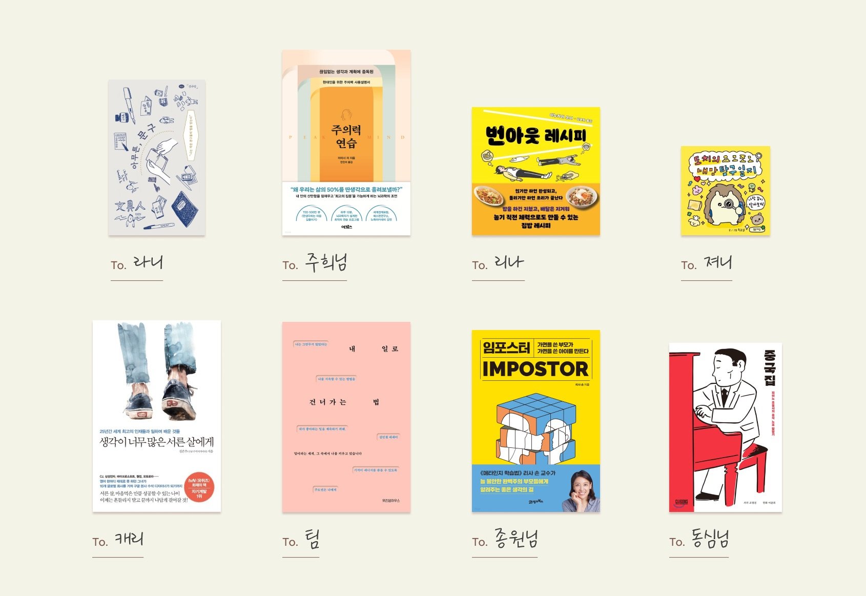
Kate, who planned this ODI Day, said she wanted to provide an opportunity to ask each other how they are and learn about each other's tastes through Manitou. Each person took the time to introduce the book they wanted to give to their manito and why, and then deliver it to them. Naturally, it became a time to share my current thoughts and the support I wanted to give to Manito.
✏️ Anyway, the phrase (Juhee → Rani)
Knowing Rani's love for stationery, I prepared a book about stationery. Anyway, there are over 50 volumes in the series, so choose whatever you like.
🧠 Attention practice (Rina → Joohee)
This is a story about people who are addicted to constant planning. I chose the book because it contained a message I wanted to convey to Juhee, who is contemplating rest and childcare, and has been running tirelessly up until now.
👩🍳 Burnout Recipe (Journie → Rina)
This is a simple and easy Japanese home cooking recipe for working moms. I hope Lina can take a break from her busy life sometimes with delicious food.
🦔 Dochi’s Diary of Exploring My Heart (Rani → Journie)
I think cute pictures and self-objectification helped me when I was stressed. I chose the book with the best review because it was a book that would allow me to look into myself.
🍀 To the 30-year-old who thinks too much (Tim → Carrie)
This is a book by Google designer Eunjoo Kim. I chose it because I wanted to gain wisdom from the experiences and concerns of a senior designer.
💪 How to move on to my work (Concentric → Tim)
I wanted to give a message of comfort and support: ‘Don’t be too hard or swayed!’
🥷 Imposter (Carrie → Jongwon)
This is about imposter syndrome, which is experienced by 62% of office workers in Silicon Valley. This is a book that helps you look at yourself accurately through metacognition, and helps you gain faith and courage, freeing yourself from anxiety and excessive responsibility.
🥟 Chinese restaurant (Jongwon → Dongsim)
We have prepared a book that feels like reading a book about a lonely gourmet that can be enjoyed lightly by children who are tired of raising children and working.
Lastly, Dear Designers
The second ODI Day ended with us sharing our concerns and tastes and conveying support. I end this article with words from Kate, who planned this ODI Day.
-
🧑🎨 See details
-
Upstage is a leading domestic AI startup established in October 2020. Upstage stands out in the large language model (LLM) industry by taking first place on the Hugging Face leaderboard with performance exceeding ChatGPT's benchmark score for the first time in OpenLLM history. Based on these technologies, we present a reliable private LLM standard that maximizes data security and solves hallucination, helping companies conveniently use cutting-edge technology. In addition, Upstage's Chat AI 'AskUp' has over 1.4 million users, establishing itself as the largest AI service in Korea. Document AI Pack, another Upstage representative solution, utilizes AI OCR technology that has won the world's most prestigious OCR competition to automate documents by increasing efficiency and accuracy. By optimizing document processing through a pre-trained model with minimal data, cost and time are dramatically minimized compared to manual methods. Lastly, through the education program 'EduStage', we are also actively engaged in the educational content business that fosters differentiated professional talent who can be immediately put into AI business through hands-on education that incorporates AI business experience and solid AI basic education.
Upstage is comprised of members from global big tech companies such as Google, Apple, Amazon, NVIDIA, Meta, and Naver, and has participated in many world-renowned AI academic societies such as NeurlPS, ICLR, CVPR, ECCV, WWW, CHI, WSDM, and DMLR. We are solidifying our unrivaled leadership in AI technology by publishing excellent papers and becoming the only domestic company to win double-digit gold medals in the online AI competition Kaggle. While working as a professor at the Hong Kong University of Science and Technology, Upstage CEO Kim Seong-hoon won the ACM Sigsoft Distinguished Paper Award, the best paper award, four times for his research on bug prediction and automatic source code generation that combined software engineering and machine learning, and won 10 awards at the International Conference on Software Maintenance. He is considered a world-class AI guru who received the most influential paper award in 2018, and is also widely known as an instructor of 'Deep Learning for Everyone' with a total of more than 7 million views. Additionally, Upstage's co-founders include CTO Lee Tal-seok, who led Naver Visual AI/OCR and achieved world-class results, and CSO Park Eun-jung, who led the model team of Papago, the world's best translator.


